uxproof — engineering reliable AI experiences
[ A self-initiated AI product designed and built end to end in React and TypeScript. I used UX engineering to turn an ambiguous AI workflow into a structured, accessible and resilient product — with deterministic boundaries around what the model can and cannot control. ]
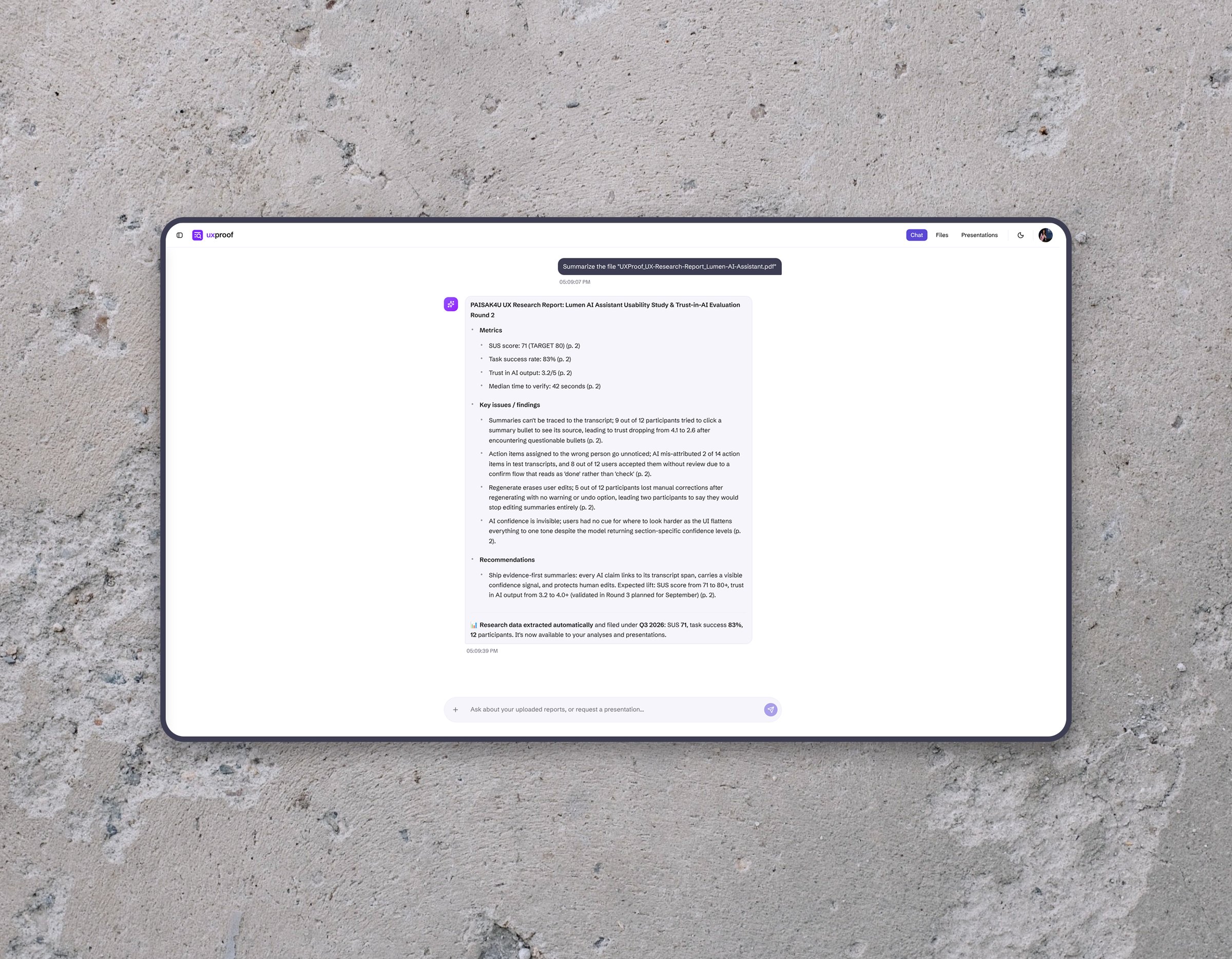
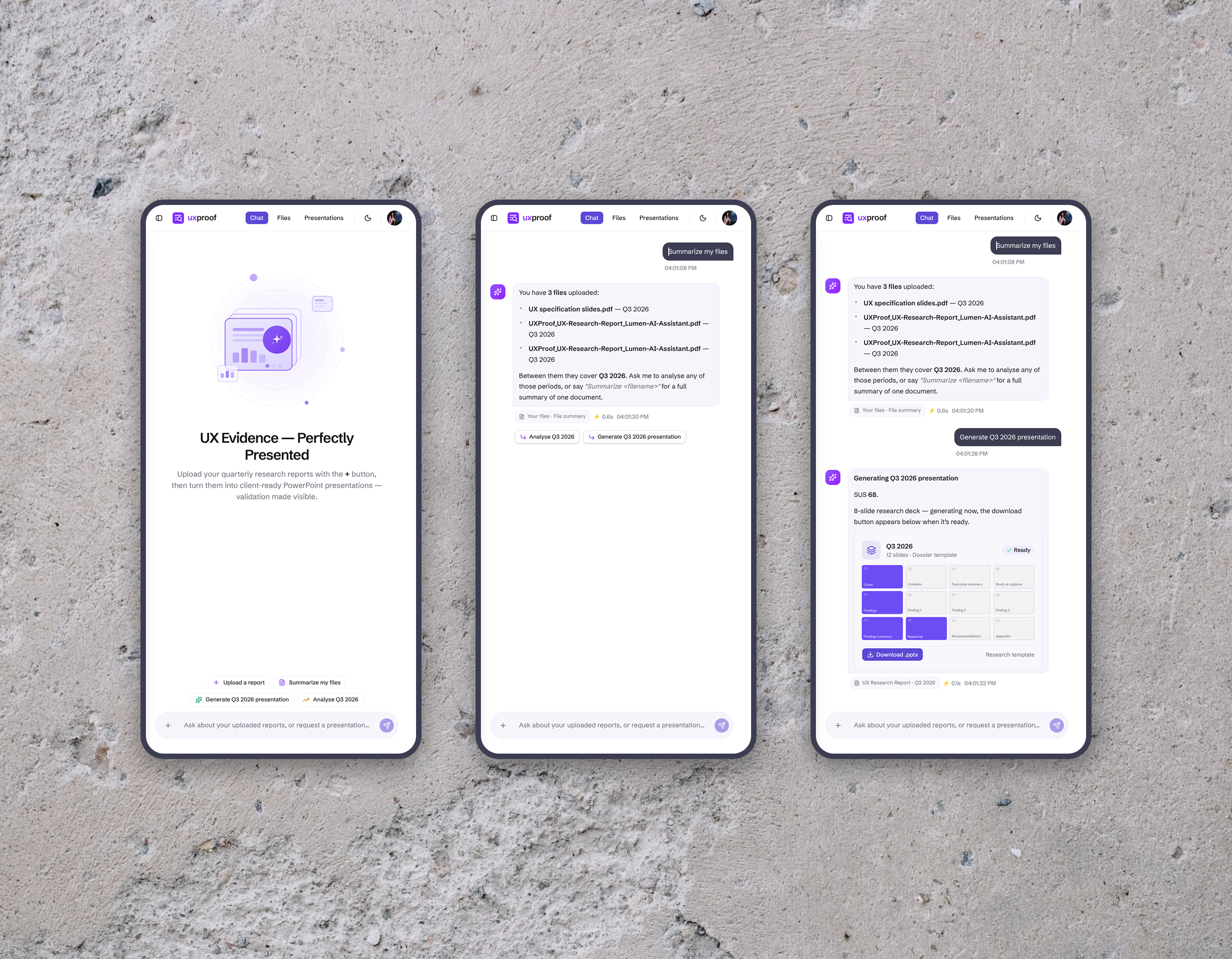
Upload the research, talk to it, get the deck.
[ Quarterly UX research kept ending its life in slide decks. Every cycle meant pulling SUS scores, KPIs and findings out of files by hand, rebuilding the same slide structures, and hoping the numbers survived the copy-paste. I treated that recurring workflow as the starting point for the product: understand what researchers repeatedly need to find, decide and communicate, then design the interaction around those behaviours.
The starting point was research practice rather than a feature brief. I used the workflow from my own quarterly research as the initial product context, identifying recurring tasks, failure modes, information needs and trust requirements before defining the interface. That led to a domain-specific information model rather than a generic AI chat: the product works with research periods, SUS scores, task results, findings and recommendations because those are the units researchers actually need to analyse, compare and communicate.
A note on what this is: a concept build, not a production product. It runs end-to-end on my own research practice — real uploads, real decks — but it exists to demonstrate an architecture, not to ship to customers. Its patterns are informed by my experience working on production AI systems. ]

An AI presenting research to a client has to be right every time, not most of the time.
[ That one requirement disqualifies the default “let the LLM write the deck” architecture before you start.
Two more constraints shaped the system: research data is confidential, so inference had to stay on the machine; and a local model will sometimes be slow, wrong, or simply down — so the product had to keep working without it. ]
Define the boundary between AI interpretation and product-owned behaviour.
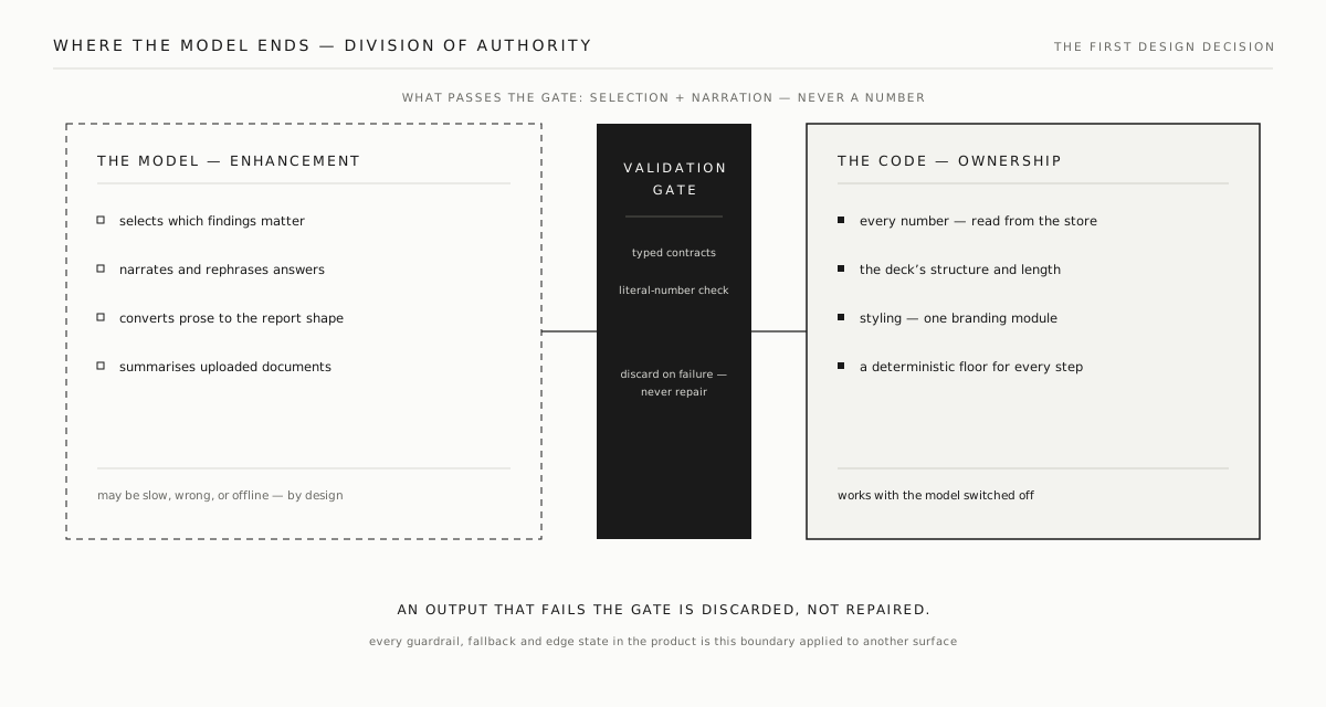
[ The first design artefact wasn't a screen — it was a boundary. Everything the model may own sits on one side: selecting which findings matter, narrating them, converting prose into a report shape. Everything it may never touch sits on the other: the numbers, the slide structure, the styling, and whether the product works at all.
Between the two sits a validation gate — typed contracts and literal-value checks — and output that fails it is discarded, not repaired. Once that boundary existed, it became the system-level decision behind the rest of the experience: guardrails, fallbacks, edge states, accessibility behaviour and rendering rules all reinforce the same division of responsibility. ]
Every number is grounded, and every model step has a deterministic fallback.
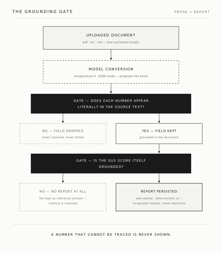
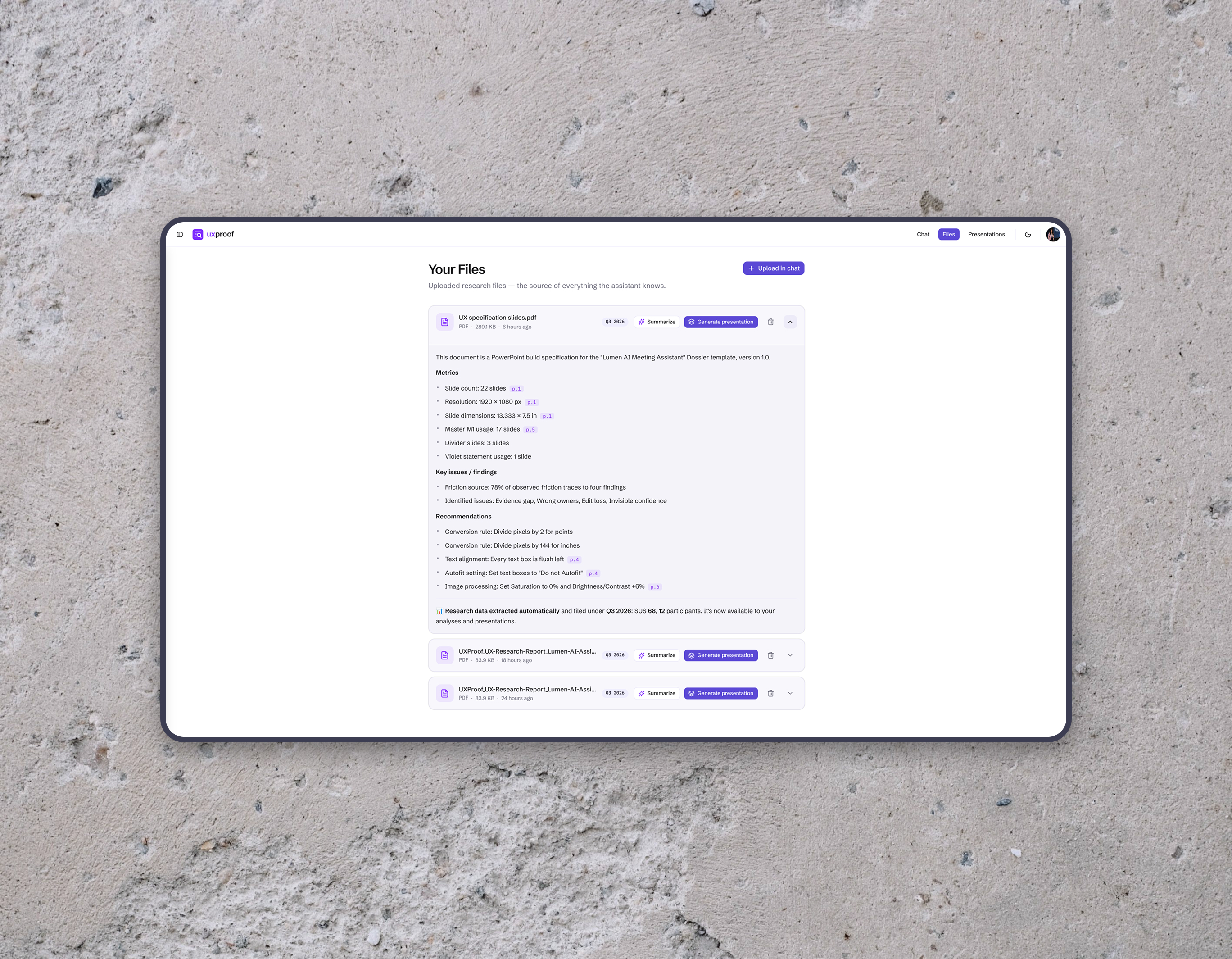
[ Grounding ] Structured uploads are parsed deterministically. Prose documents go through a model conversion with a literal-value guardrail: every numeric field must appear verbatim in the source text or it is dropped, and a report without a grounded score is rejected outright. The same rule polices chat answers and document summaries — any reply whose numbers can't be traced to stored data is discarded in favour of its deterministic template.
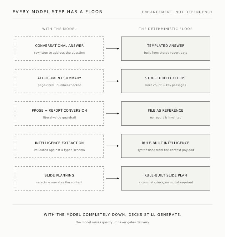
[ Fallbacks ] The LLM is an enhancement, never a dependency. Every model step has a deterministic fallback: conversational answers fall back to templated ones, summaries to excerpts, extraction and planning to rule-built equivalents. With the model completely offline, decks still generate.
[ Deliverable ] The output is a PowerPoint deck drawn from a library of thirteen slide types, and its length follows the evidence — a slide appears only when the figures behind it exist. The model selects and narrates content; deterministic rendering rules own layout, typography and branding. The deck cannot drift, because the model never touches it. ]
The model interprets. Code owns the facts.
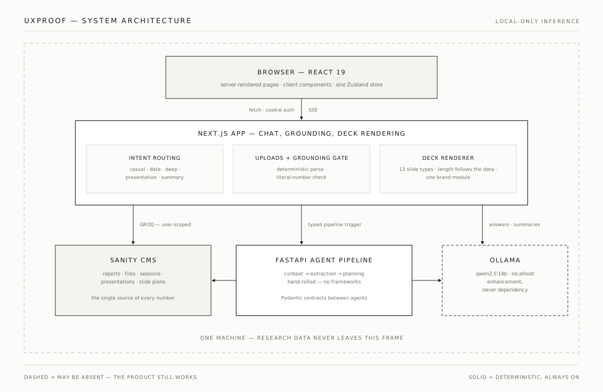
[ The architecture is split into explicit ownership boundaries: the Next.js app owns the interaction layer, uploads and deck rendering; a FastAPI service owns slide-plan generation; a headless CMS stores reports, sessions and plans; and local model inference is confined to explicit AI boundaries. Deterministic code owns the facts, validation, structure and rendering.
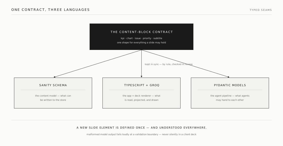
Deck content comes from a hand-rolled multi-agent sequence — context, extraction, planning. Plain Python, no orchestration framework. Agents exchange typed Pydantic contracts, so malformed model output fails loudly at a validation boundary instead of leaking into a client deck. ]
The information architecture follows the researcher's workflow, not the model's capabilities.
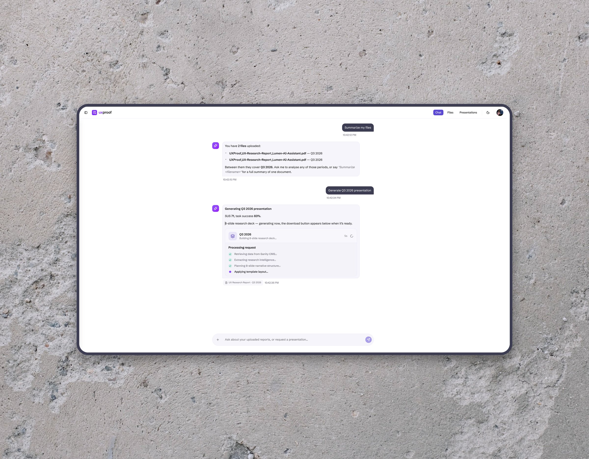
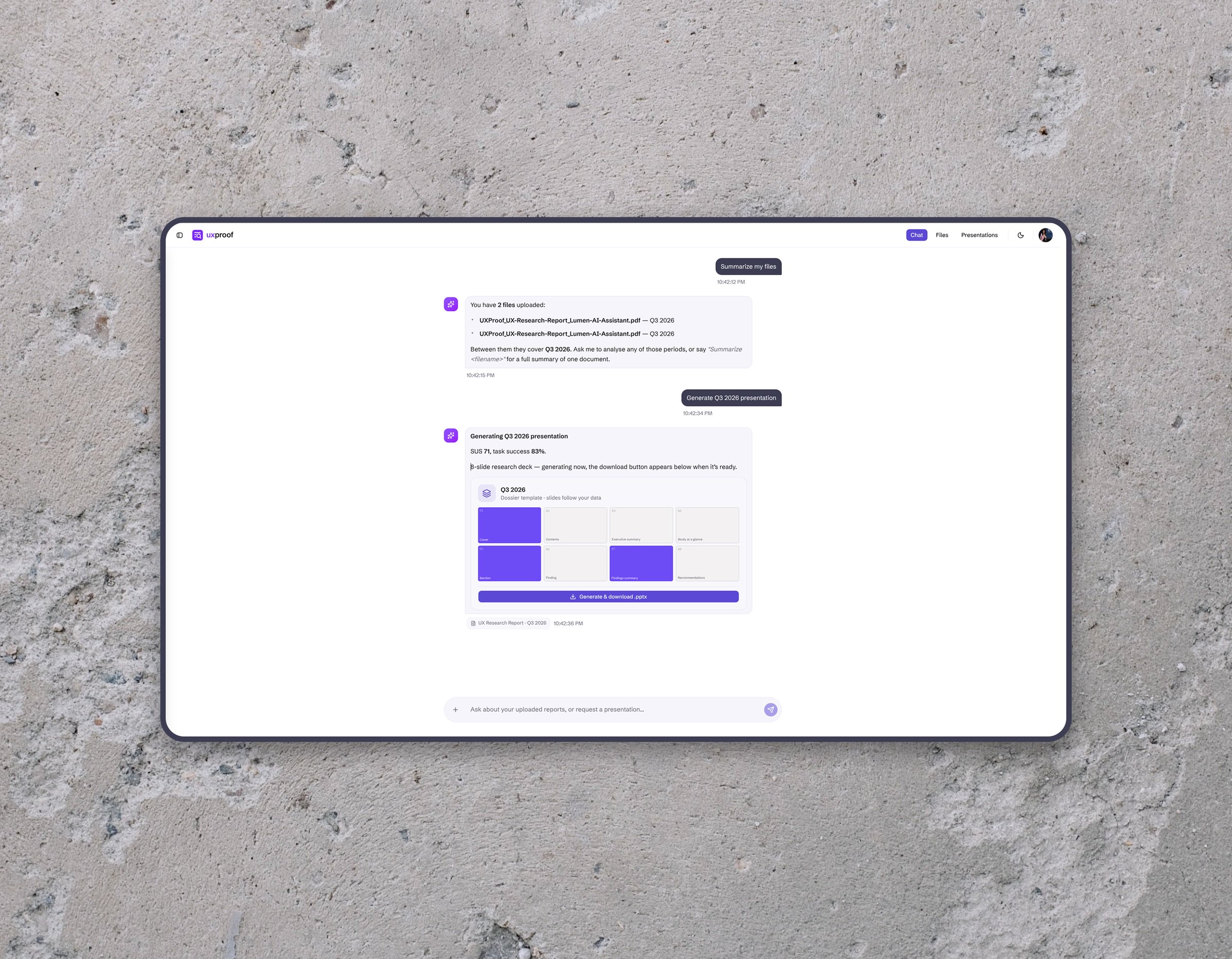
[ The workflow is chat-first and upload-grounded, but the architecture underneath it is structured around the researcher's mental model. Research files become evidence; evidence becomes reports and periods; reports become conversation context; conversation becomes analysis and, eventually, a presentation. Files go in through the chat's plus button; structured data — quarter, year, SUS score — is parsed into per-user reports, and prose documents are converted by a local model under a strict guardrail. From there it's plain language: “Analyse Q3 2025”, “Compare Q2 vs Q3”, “Generate the 2025 presentation”.
The conversation itself is designed, not just parsed. A bare “yes” after the tool offers a presentation becomes a real generation request; a follow-up question with no period named inherits the last one discussed; a workspace with no data gets an upload prompt instead of machinery running on nothing. ]
Accessibility is part of the interaction model, not a final polish pass.
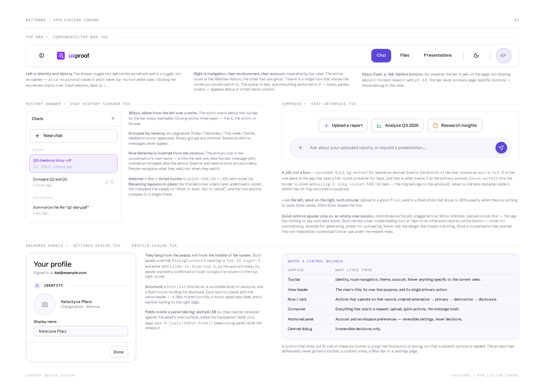
[ The chat surface is keyboard-operable throughout the primary interaction flows. Every icon-only control — upload, send, history, account — carries a real label; focus rings are visible on every interactive element; and hover-revealed actions, like deleting a conversation, also reveal on keyboard focus, so nothing in the product is pointer-only.
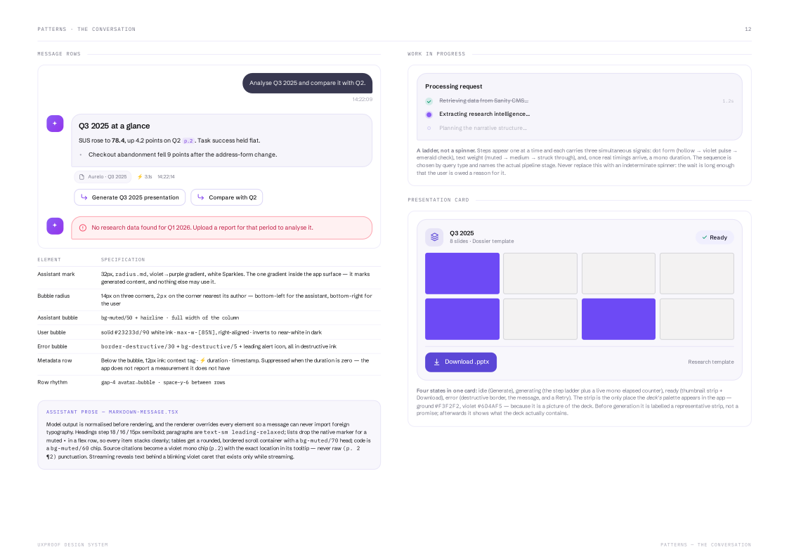
State changes are announced, not just painted: toasts are polite live regions, errors are alerts, expandable summaries expose their open state, and the active conversation is marked for assistive tech. Uploads render optimistically, generation cards move through honest idle / working / done / error states, and a restored session never silently re-fires an old generation.
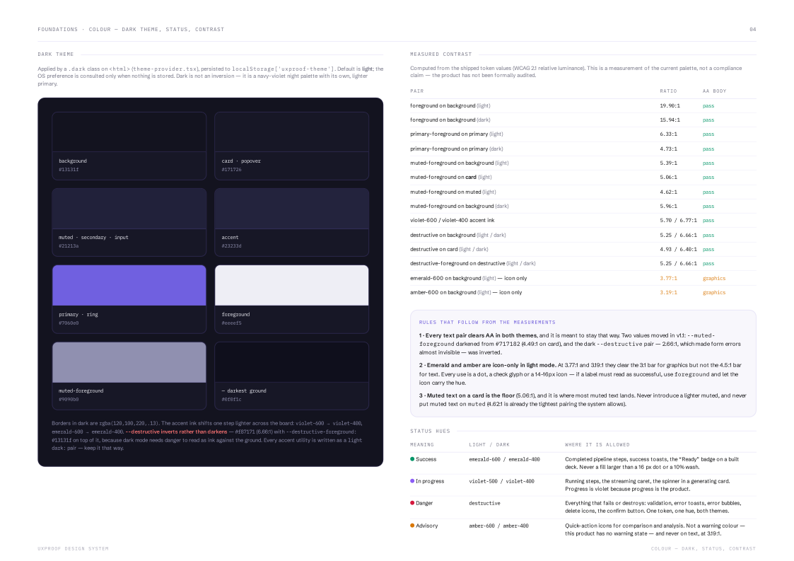
Colour is held to the same standard, measured against the shipped tokens rather than assumed. Every text pair is calculated from the values actually shipping and listed with its ratio, passes and failures alike. Two colours moved because of it: muted text was darkened until it cleared 4.5:1 on every surface it lands on, and the dark-mode error pair — 2.66:1, which made form errors nearly invisible — was inverted. The page names the weakest point out loud, and the two hues still under the bar are icon-only by rule. ]
The design system defines interaction boundaries as well as visual styles.
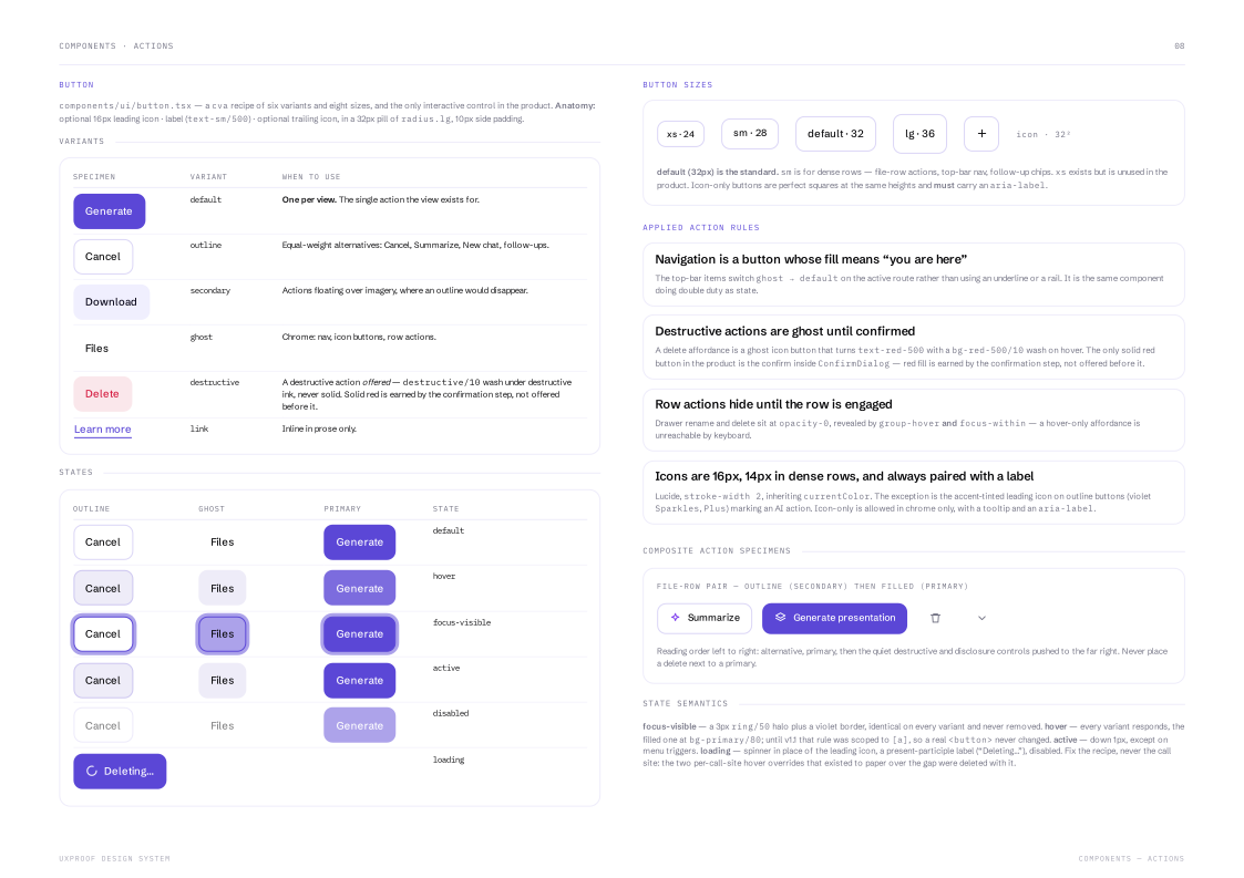
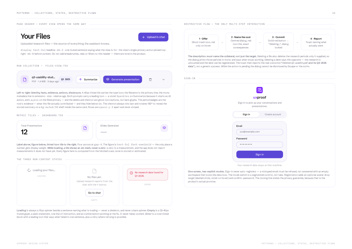
[ The application's system is sixteen pages and a machine-readable token file. The most useful page in it is not about styling: it is a table of the six places a control is allowed to live — top bar, view header, row or card, composer, anchored panel, centred dialog — and what each one may hold. The rule underneath is what does the work: a control that fits none of those six homes means the interaction is wrong, not that a seventh surface is needed. That is why the product has never grown a toolbar, a context menu, a filter bar or a settings page.
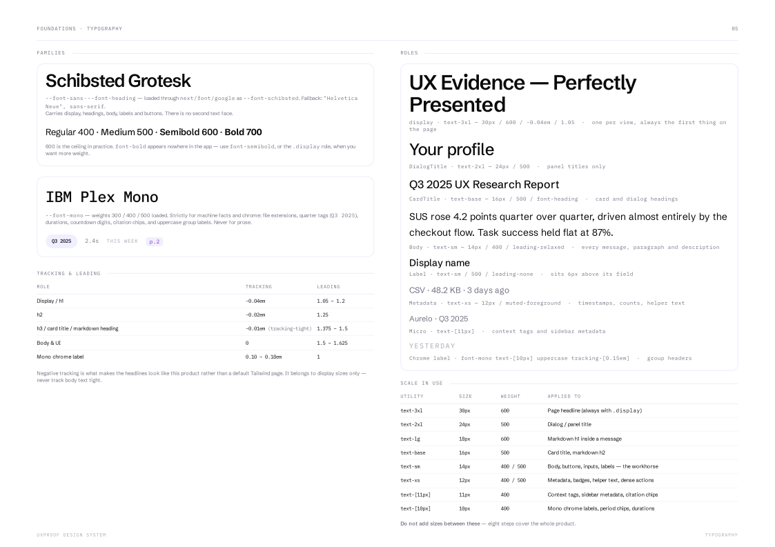
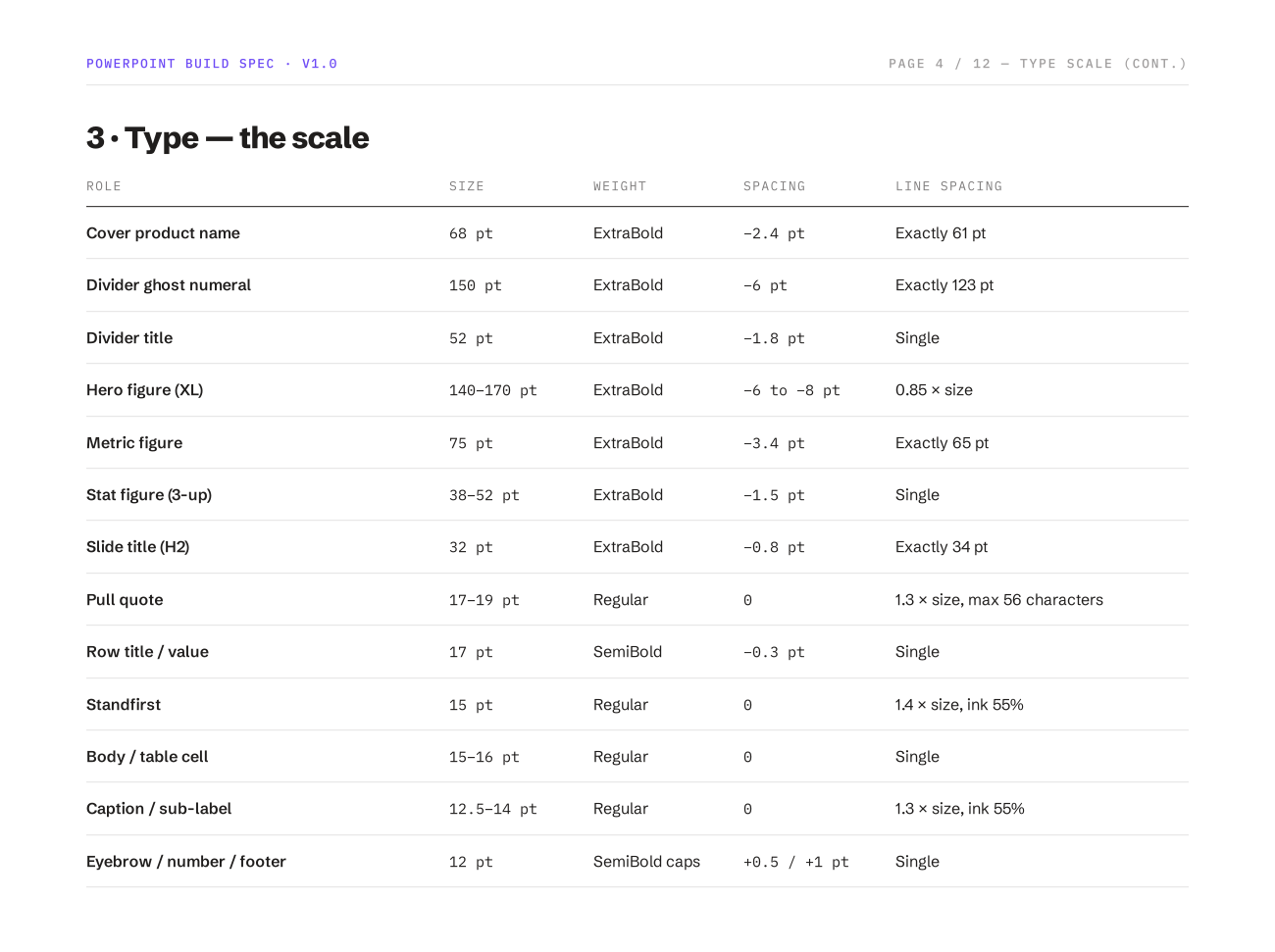
The rest of it works the same way — rules rather than swatches. Type is two families and eight steps, each tied to a job, with an explicit instruction not to add a ninth. Emphasis is a budget: one filled button per view, navigation whose fill doubles as state, destructive actions kept quiet until the confirmation step. The three non-content states are specified rather than improvised, and so is the destructive flow that names the research periods a deletion will take with it.
The generated deck has a system of its own, deliberately separate from this one. They share two typefaces and nothing else, and neither system's tokens may appear in the other. ]
AI generates quickly. I own the UX quality bar.
[ uxproof was developed with an agentic AI workflow, but the division of responsibility is deliberate: AI accelerates implementation — scaffolding components, proposing refactors, generating test plumbing and exploring alternatives — while I own the decisions that require UX and engineering judgement: interaction behaviour, information architecture, edge states, accessibility, visual quality and system consistency.
The review bar doesn't live in my head — it lives in the repo. A project brief encodes the invariants every generated change is checked against: numbers are never model-authored, every model step has a fallback, the deck template has one source of truth, and pages stay server components while interaction lives in client components. An auditor reviews changes against those invariants; tests generate versioned readiness reports; documentation is regenerated from the implementation so the system does not drift away from what was actually built.
The important shift is from reviewing AI output one change at a time to designing a system that constrains it. When generated output repeatedly introduced one-off spacing values and accent colours, I did not keep correcting the same problem manually. I encoded the rule into the project brief and branding module so future output — whether generated by AI or written by me — is evaluated against the same design constraints.
AI generates → UX engineering evaluates → the design system constrains → tests verify. That loop lets me move faster without lowering the quality bar. ]
The slides' design system is separate from the application's, and stricter.
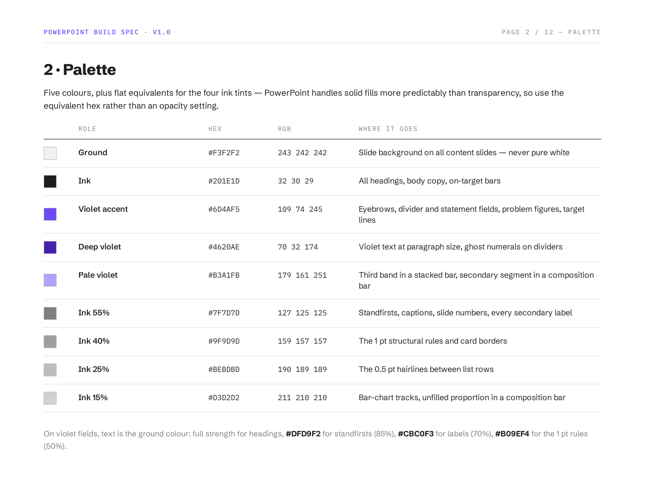
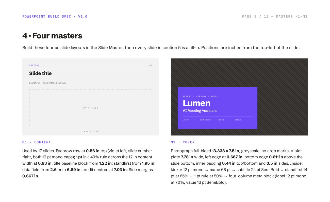
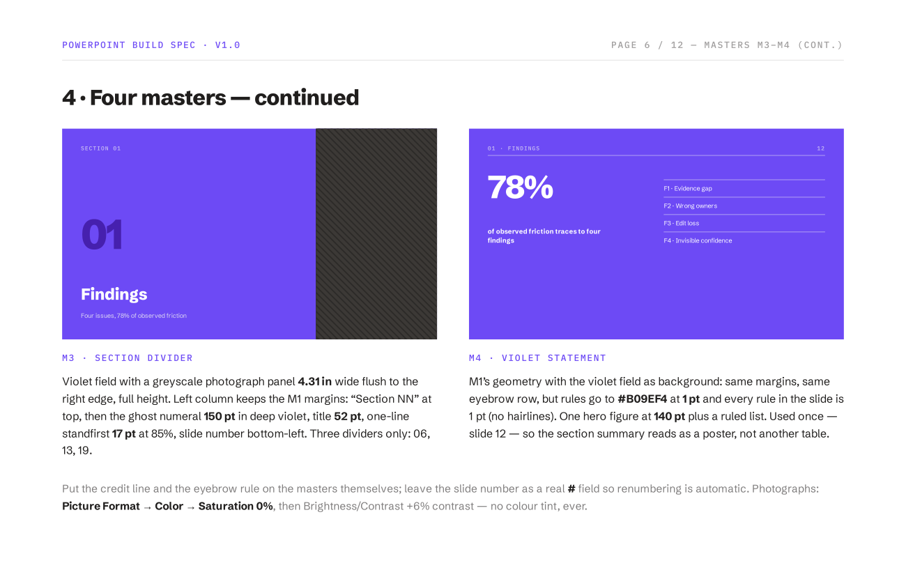
[ The deck is built on four masters — content, cover, section divider, and one violet statement poster used once so the section summary reads as a poster rather than another table. It has its own palette: a ground that is never pure white, one ink, a violet accent with deep and pale variants, and four flat ink tints that do the structural work of rules, hairlines and chart tracks.
Its rules are absolute rather than advisory. Corner radius is zero on every rectangle, chip and card; no shadows, no gradients. Charts are drawn as shapes, never as live chart objects that would drag in their own fonts and colour theme. Text is flush left everywhere except the footer credit and chart axis labels. And at most one figure per slide is violet — violet marks the problem, so if everything is violet nothing is.
The template is a library, not a running order: a short readout is a subset, and the instruction is to delete the rest rather than rush them. That is the same rule the renderer enforces in code, where a slide is emitted only when the figures behind it exist. ]
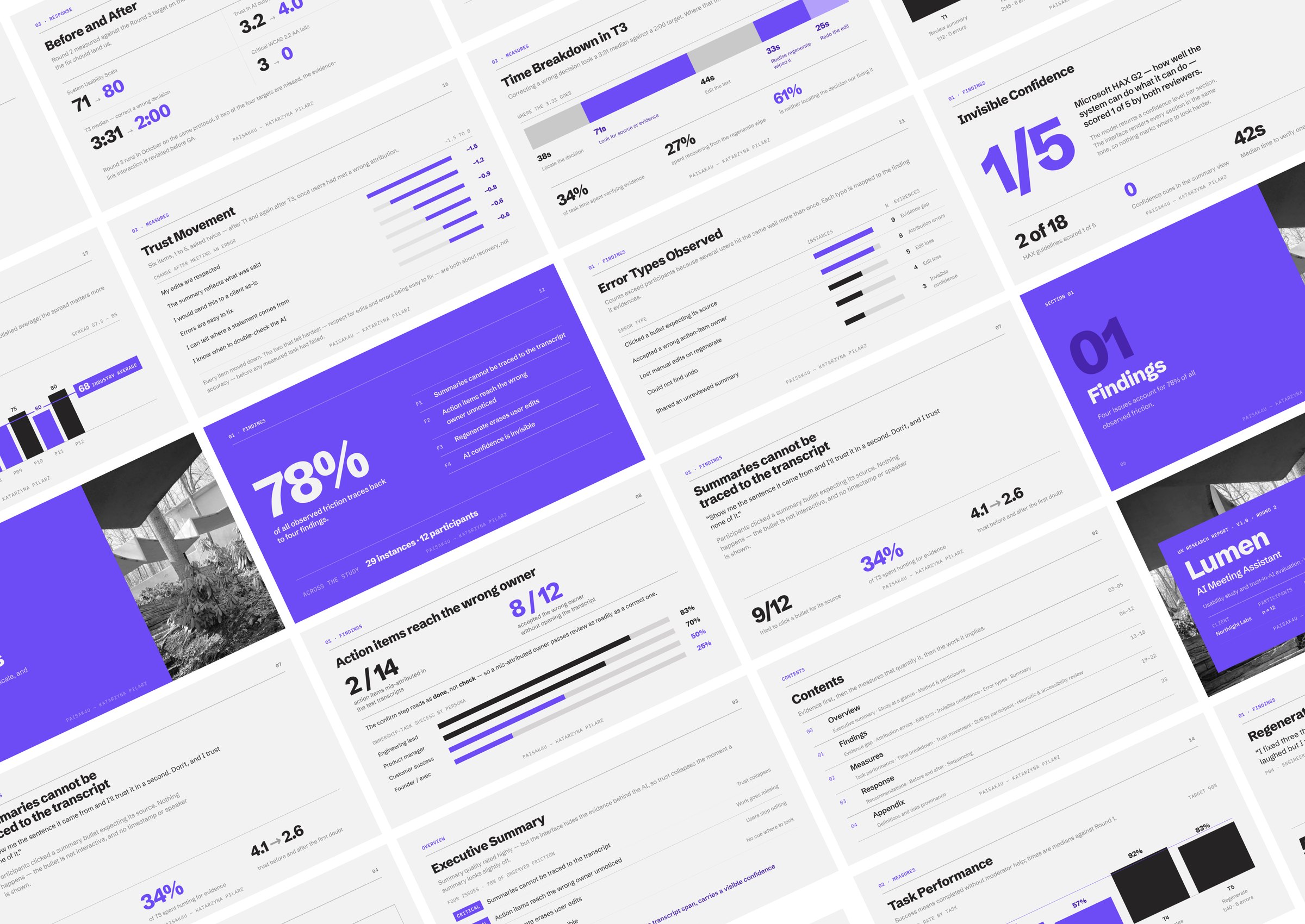
A complete working prototype — designed, engineered and validated end to end.
[ A working research-to-presentation workflow: chat-first interaction, evidence-driven deck generation, explicit loading and error states, a reusable design system, measured accessibility decisions and deterministic fallbacks when AI is unavailable. The prototype connects product thinking, UX research practice, interaction design, React engineering and AI-assisted implementation in one system.
Its quality lives in decisions a screenshot doesn't show. Responsive work, for one, is a series of decisions about what to lose.
I have not measured adoption, usage or time saved, so I don't present invented outcome metrics. What I can demonstrate is the complete experience — from interaction model and design system through React implementation, AI behaviour, validation and presentation output. ]
Design the boundary before you design the feature.
[ Quality cannot depend on someone remembering to check the same thing repeatedly. Decide what the model owns, what the product owns and what the user needs to understand, then encode those decisions in the interaction model, information architecture, design system, types, validation and tests. That turns UX quality from an individual review task into a property of the system — and makes AI-assisted development faster without making the product less deliberate. ]